TRAILS Design
TRAILS is a nonprofit organization that enables school staff to deliver mental health programming and education to students in K-12. I currently work as Design System Lead / UX Engineer as we prepare to launch a 2.0 version of our program.
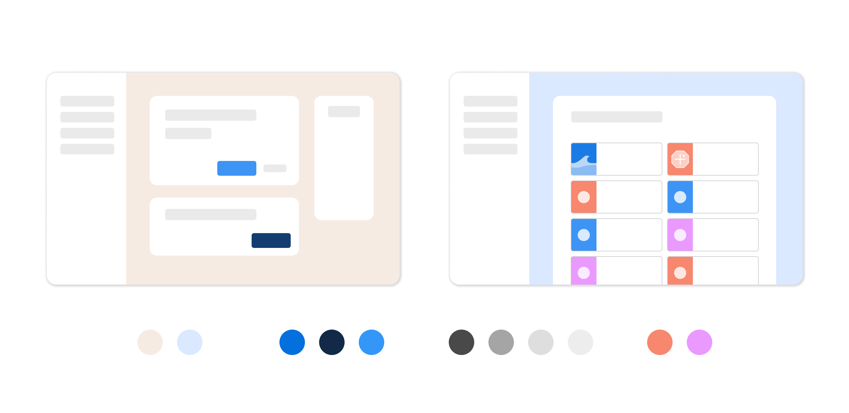
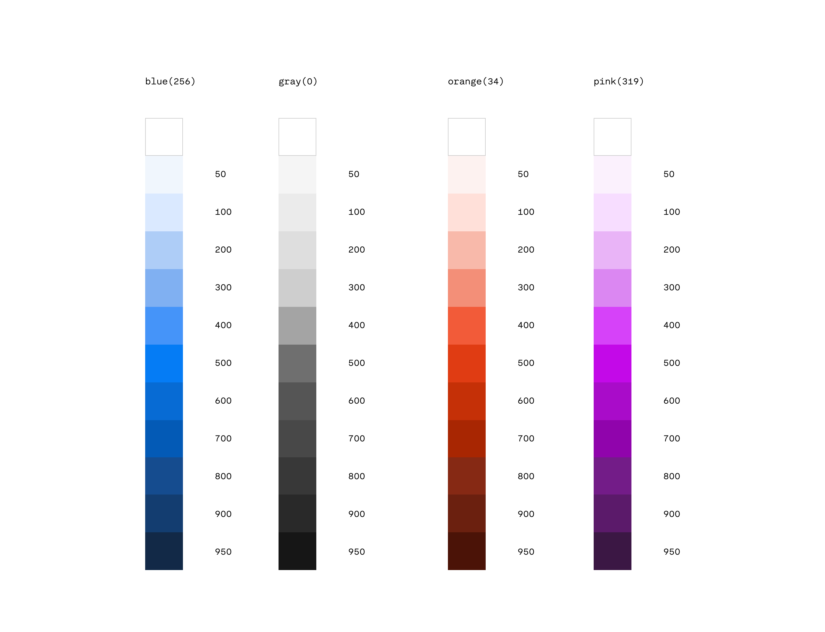
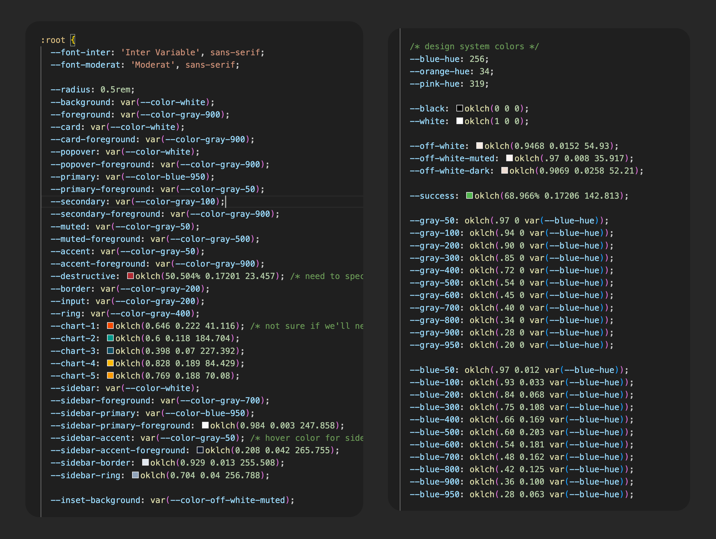
When I started with TRAILS, they had just received a new branding guide that focused mainly on marketing materials. It was my job to translate it into a product-compatible Design System that could be used for the web platform, where we host learning courses for school staff and resources they can use with students.
My being a design/dev hybrid let our designers work in low to mid-fidelity, and when the time came to build, I translated the functional intent from Figma wires while personally filling in the blanks like responsive behaviors and content constraints. This also meant that we didn't need to fully compose a Figma design library, as the number of designers on the team didn't quite justify the effort to maintain one, especially when there was so much plasticity from building out the 2.0 product.
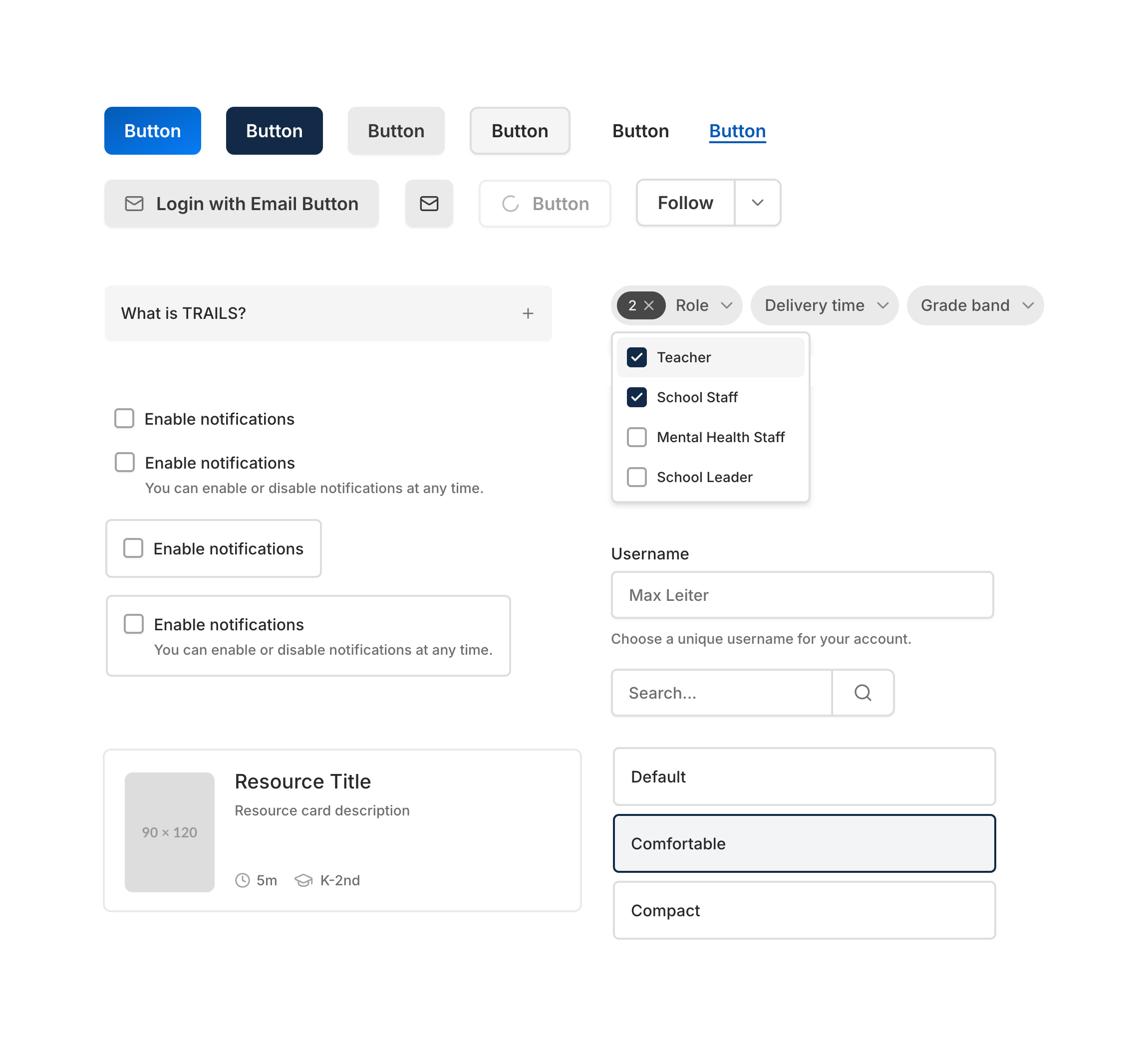
Another result of being a small team -- we leveraged Shadcn's headless component library as a base for commonly used primitives, while building upon them to develop a few custom components as necessary. Beyond just the basic theme variables though, I also adjusted the styling for each import so that felt like a unique brand and not just a barely customized Shadcn project that you see often on the web these days.
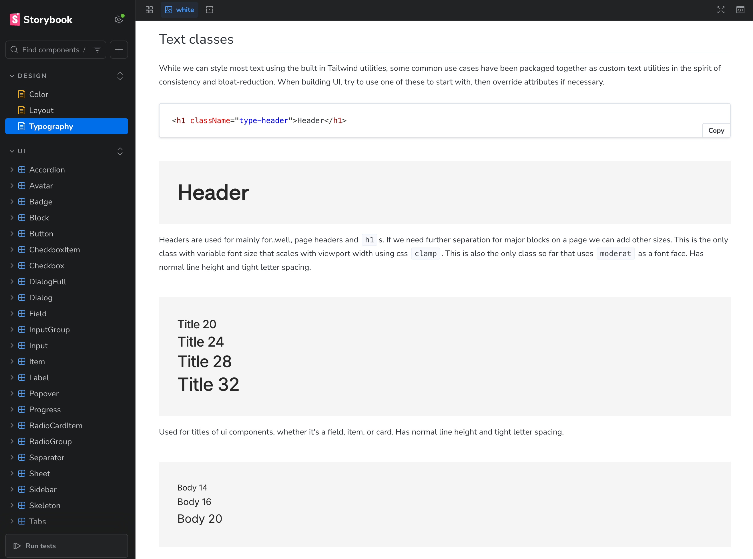
I configured and built essentially all the components in our Storybook, including things like their skeleton loading states and their placement grids. Each component also had a basic set of Storybook stories to display and test their various states.
When the frontend build of 2.0 began, I configured the overall app shell (our app uses Tanstack Start), including the navigation, column system, and base responsive behavior. And as features started getting built out, and the PRs started rolling in, my role was the design sign off and review of every frontend PR. What I couldn't get to in a sprint (it's hard matching the pace of many other developers), we would merge in and create design pass tickets for the following sprint. It kind of worked... other than me feeling sometimes like I was drowning in PR review.
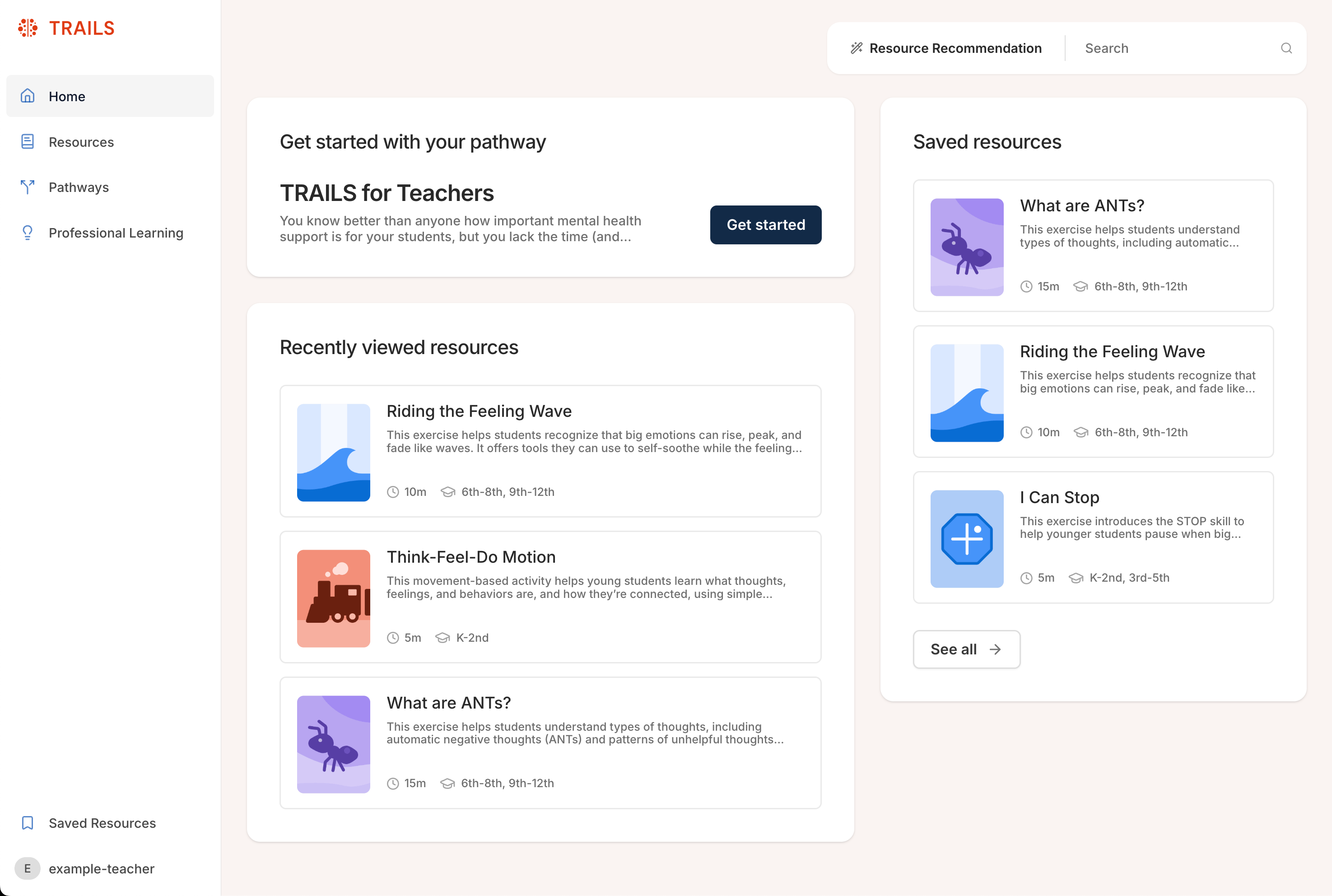
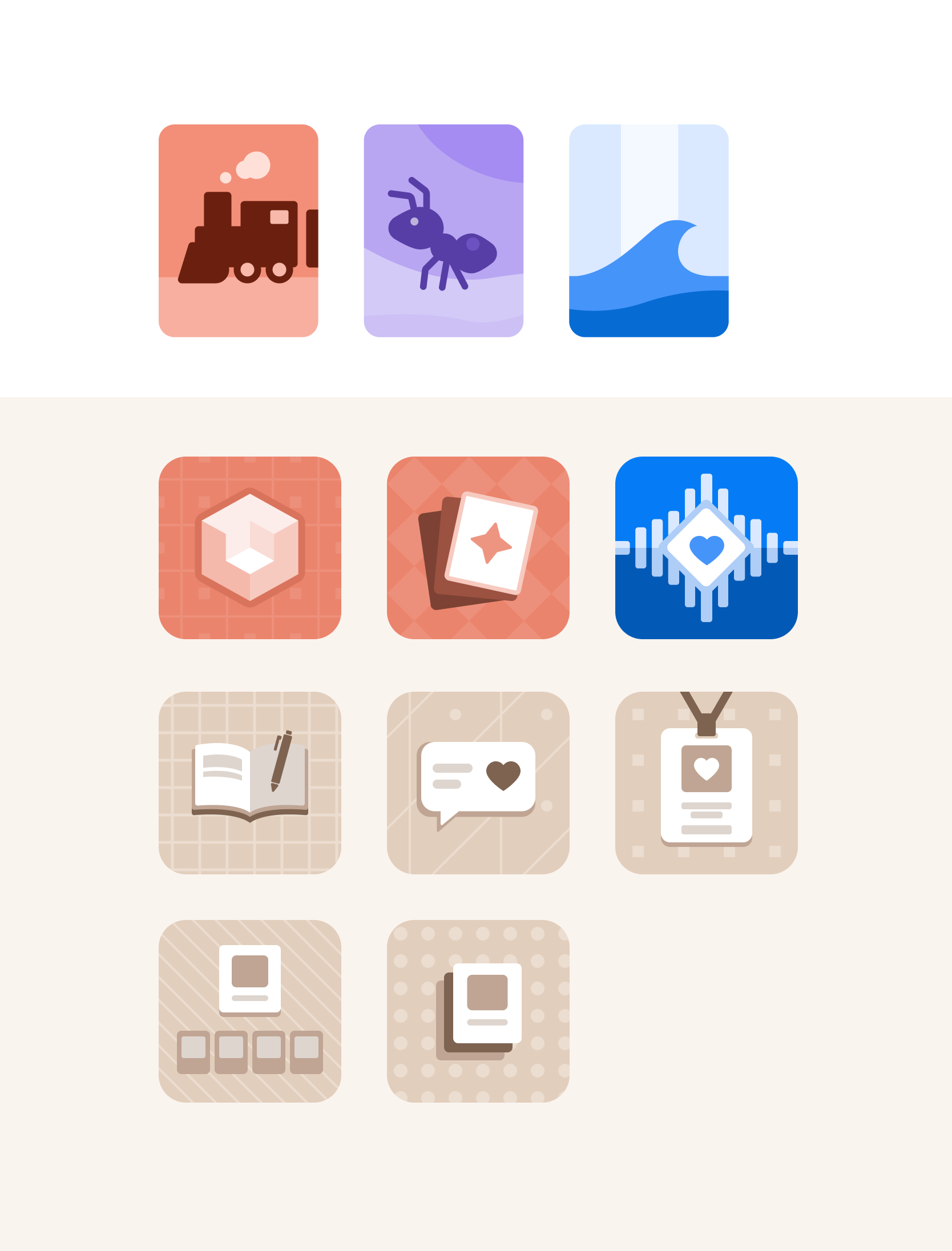
In addition to heads-down dev work, another responsibility was injecting some fun and color into our content. The older version of the product used tiny pdf previews for resource cards, and basically no imagery elsewhere. I took on the task of creating a visual color-coding system based on our mental health skill categories, and began creating a set of thumbnails for the many item cards across the app.
In addition to all of the above, I also do lofi ideation work and partner with the (currently only other) designer to work through implementation nuances and iteration.
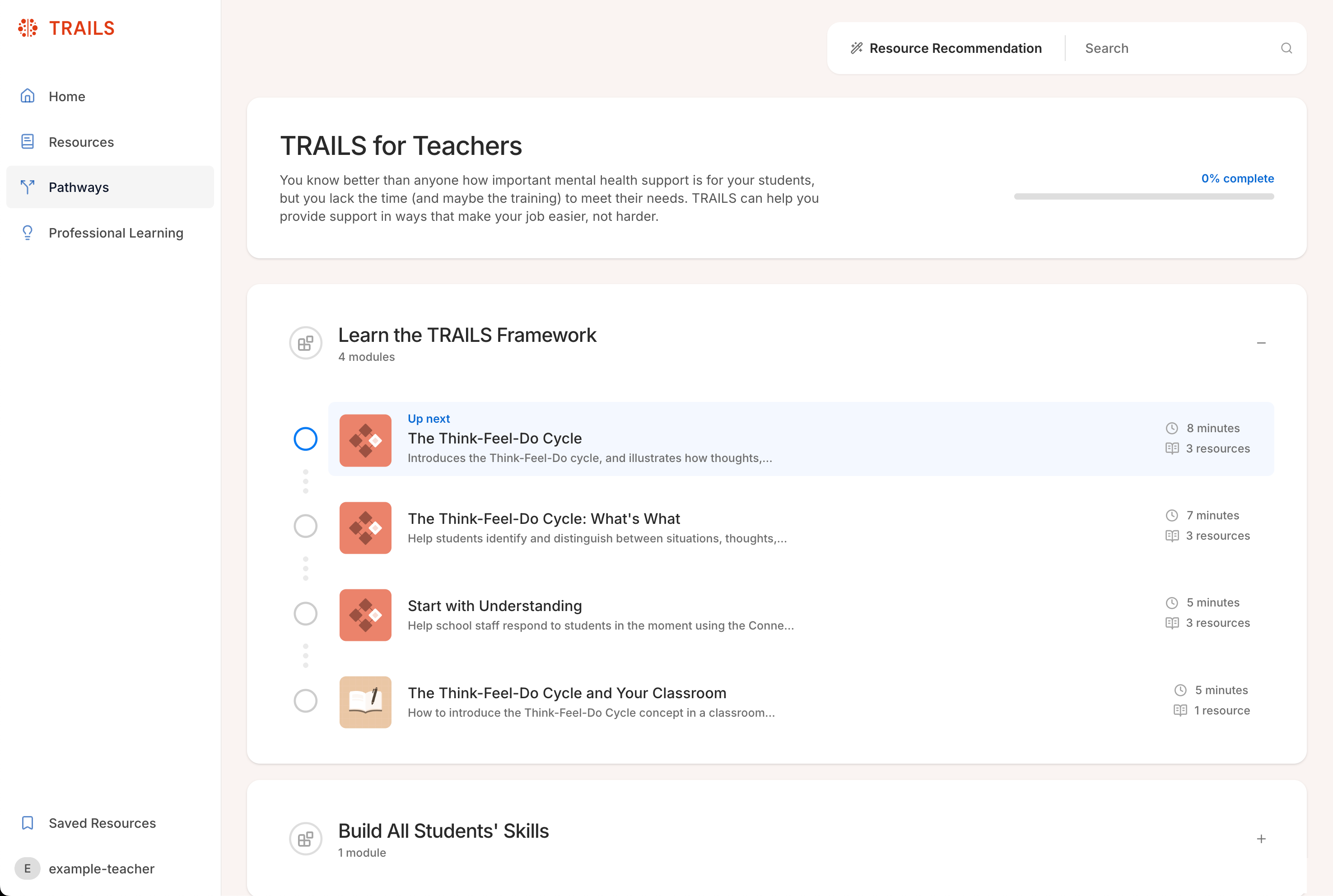
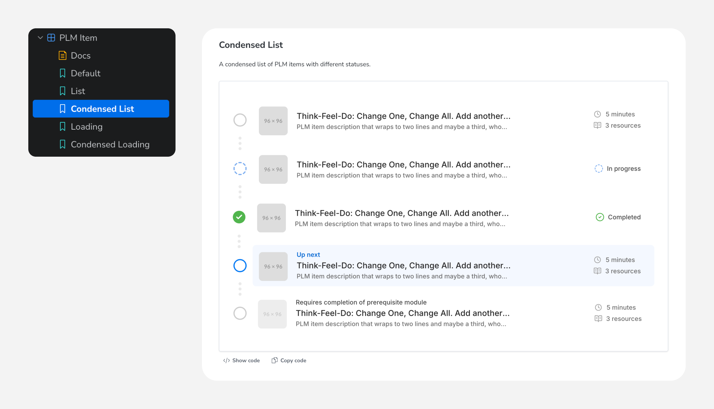
We're currently in the thick of building and trimming of features for MVP, but below are a few screenshots of the actual current staging build.