Bluemine
IBM
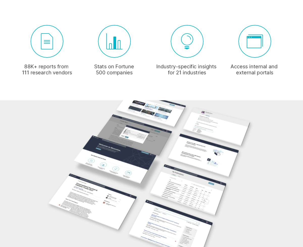
Bluemine was an internal research app at IBM. It served as an aggregator of several external and internal market intelligence reports, a publishing tool for internal analysts, as well as a directory for internally authored tools and dashboards.
Shortly after I joined the design team in the Market Development & Insights division, our group was tasked with redesigning and updating the app from the ground up. The resulting 1.0 version led to major tested improvements to experience and architecture, as well as inclusion in the list of 2019 Nielsen Norman Intranet Design winners.
I started out mostly working on the foundational UX of the app for other designers to build and iterate upon, as well as supporting the front-end development crew. After the 1.0 release, I began taking more of a leadership role, guiding large swathes of the overall experience and leading implementation of a large feature branch.
Some of my contributions include:
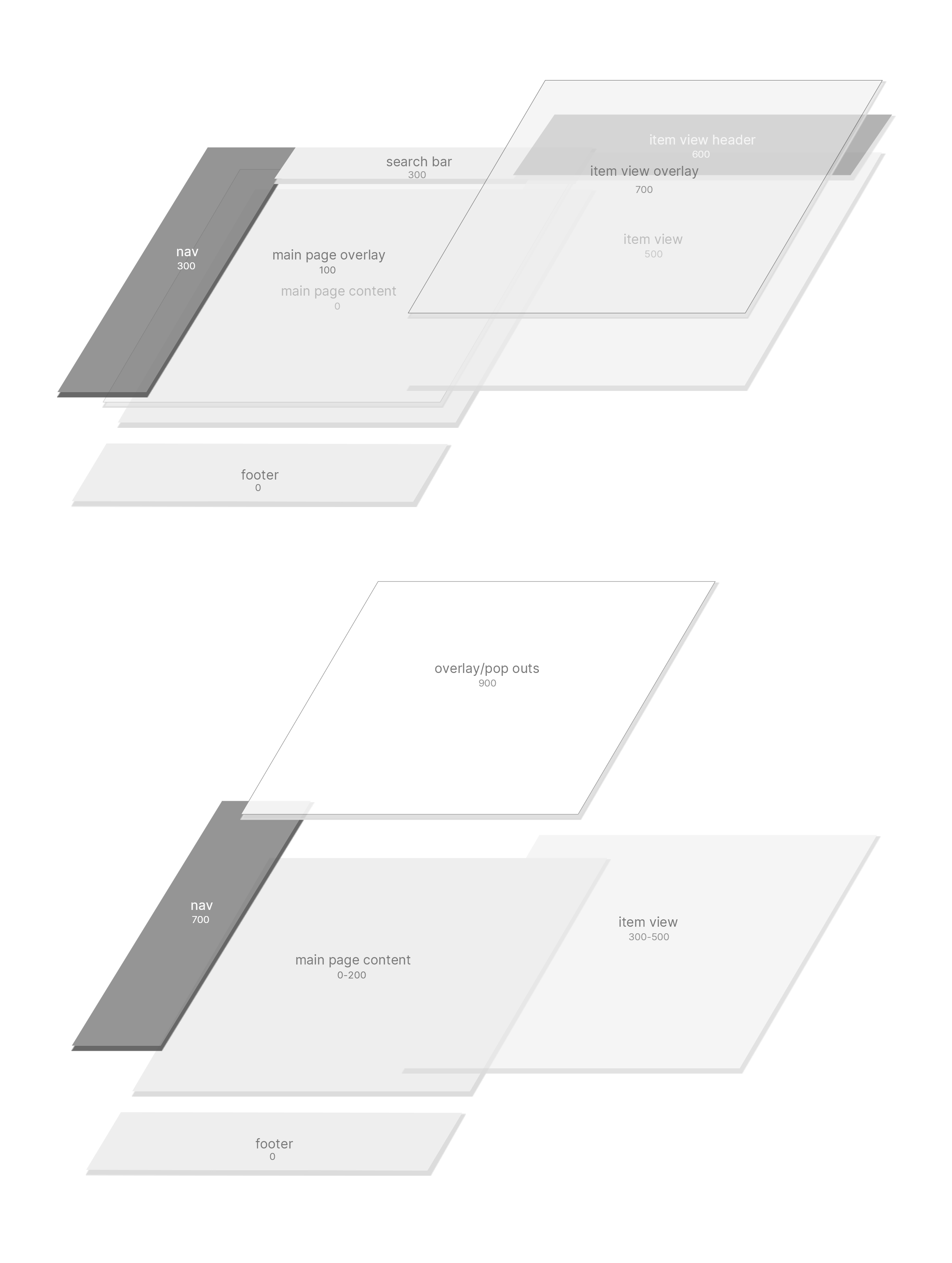
- Foundational wireframes for app navigation and structure
- User flows and gray wires for publishing process
- Occasional high fidelity mockups for certain views
- Front-end support, PR review for any designs I've contributed to
- Front-end implementation/refactors of certain views
- Squad leadership responsible for overall user journey, onboarding, and support
- Leadership of a Channels feature set - a Reddit-like space of information exchange and conversation about market topics
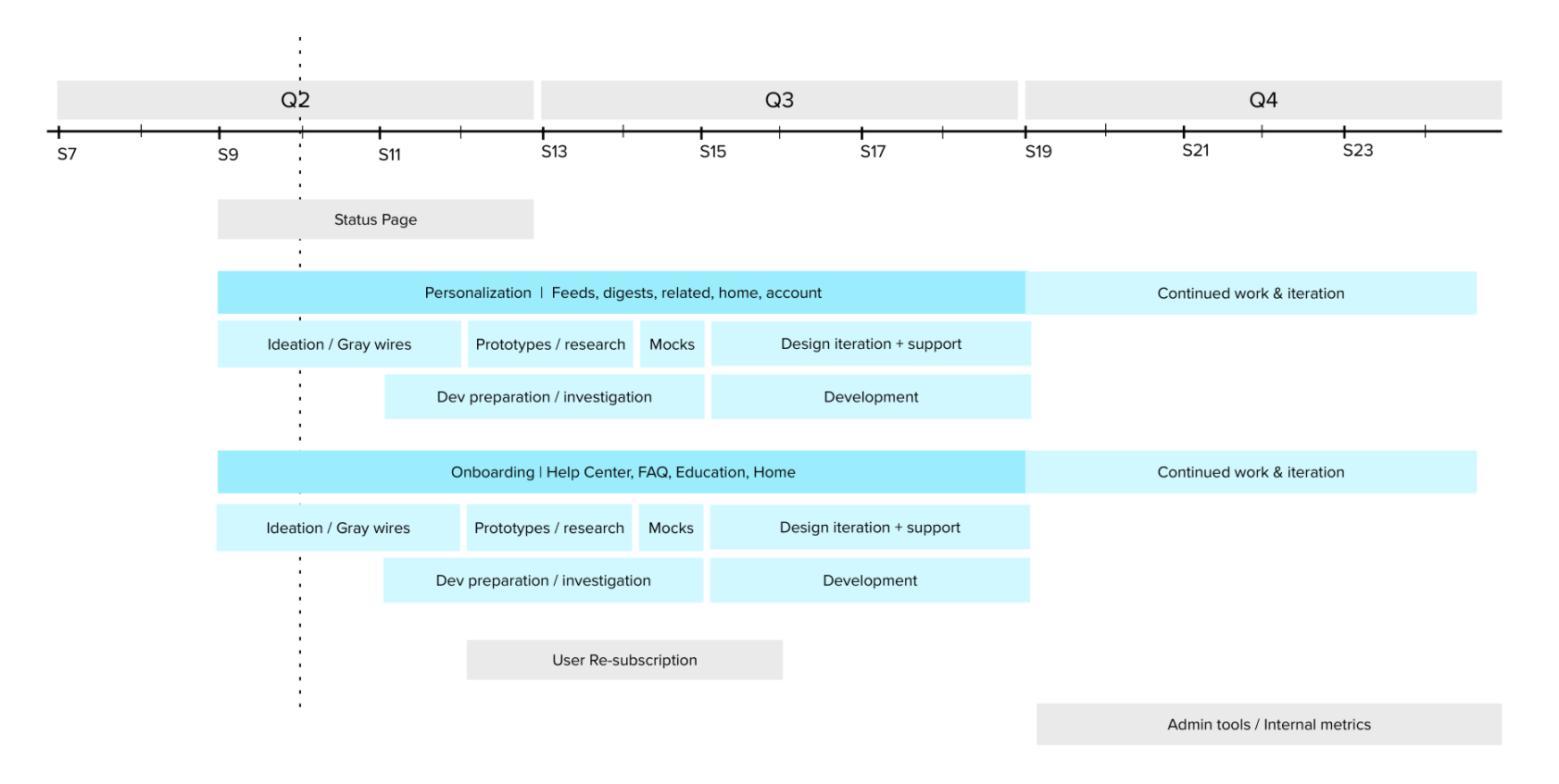
I could easily write a novella about this behemoth of a project -- especially on the Channels feature branch, which I initiated and pitched to key stakeholders. It could probably be case page on its own...but might be better suited for an in-depth conversation. Meanwhile, here are some examples of other pieces of work from this project.
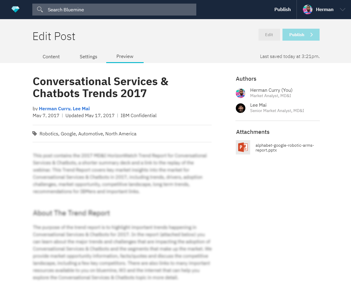
A lot of my front-end work was focused on visual alignment with mocks, accessibility standards, and optimization (like re-writing the report view component to allow it to be called from the preview tab in edit mode).
When Bluemine later started its migration to Carbon Design System, I defined a set of custom layout types with Bluemine's existing views in mind.
Our squad calls would often involve devs whiteboarding and relaying data/API details while I go over these stories, making for a close syncronization between design and dev.
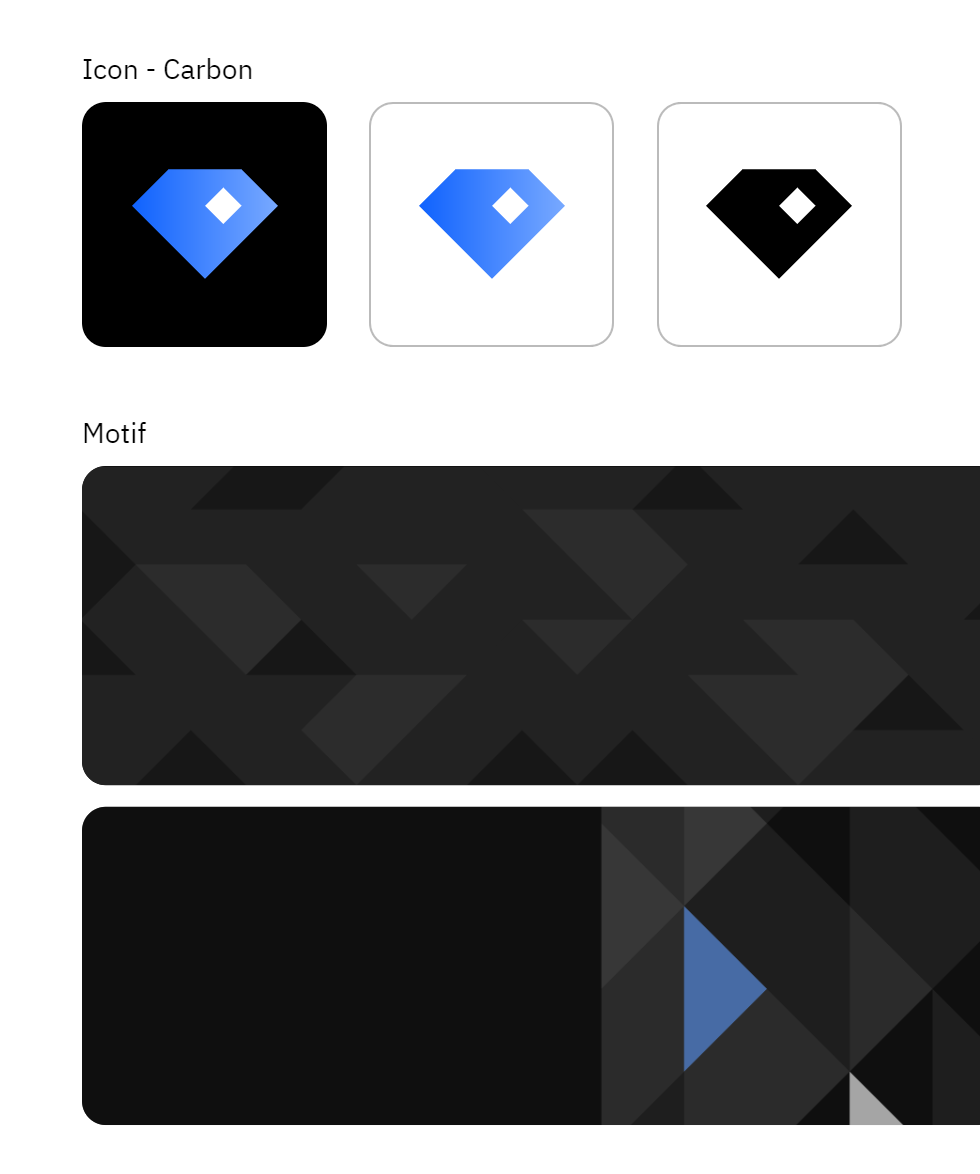
I created the matrix of vector artboards for exports of all sizes and contexts and created a style/brand guide(something I wish I had saved to show here...).
When the app migrated to Carbon Design, I updated the branding(pictured above), and also established visual motif and updated illustrational styles to be in line with broader Carbon guidelines.