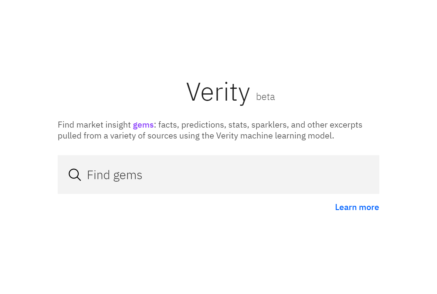
Verity
IBM
A few years into my time at IBM's Market Development and Insights department, I moved to a team dubbed MD&I Labs as its sole designer. The smaller team of market analysts, data scientists, and developers focused on rapid prototyping of experimental tools for internal(and potentially external) use.
One of the apps that gained significant momentum was Verity, a tool that scoured market analysis reports for gems -- key phrases and figures -- to help facilitate research. It did so via machine learning and some manual training where sentences were given a score based on their informational value. Basically, it was a specialized tool for generating highlights from documents.
I did all the design work for Verity through several iterations, although much of it was facilitated by a company-wide migration to Carbon Design System. All of the MD&I Labs projects were heavily UXR driven, so I also helped lead much of the rounds of research along with support from the UXR lead from the main design team.
The beta release of Verity focused on gem search and saving, with future improvements planned for setup of automated feeds based on input parameters. Also in the works were more batch jobs compiling popular items and a personalization algorithm to populate a user's home feed. All in all, Verity was meant to be a lightweight app meant to do one thing well -- to facilitate research by surfacing high value statements and figures.
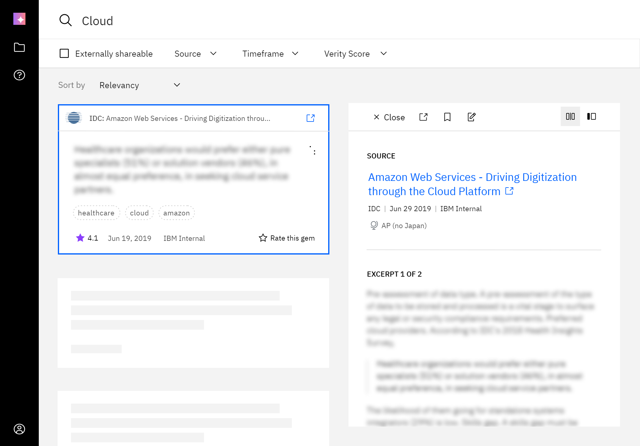
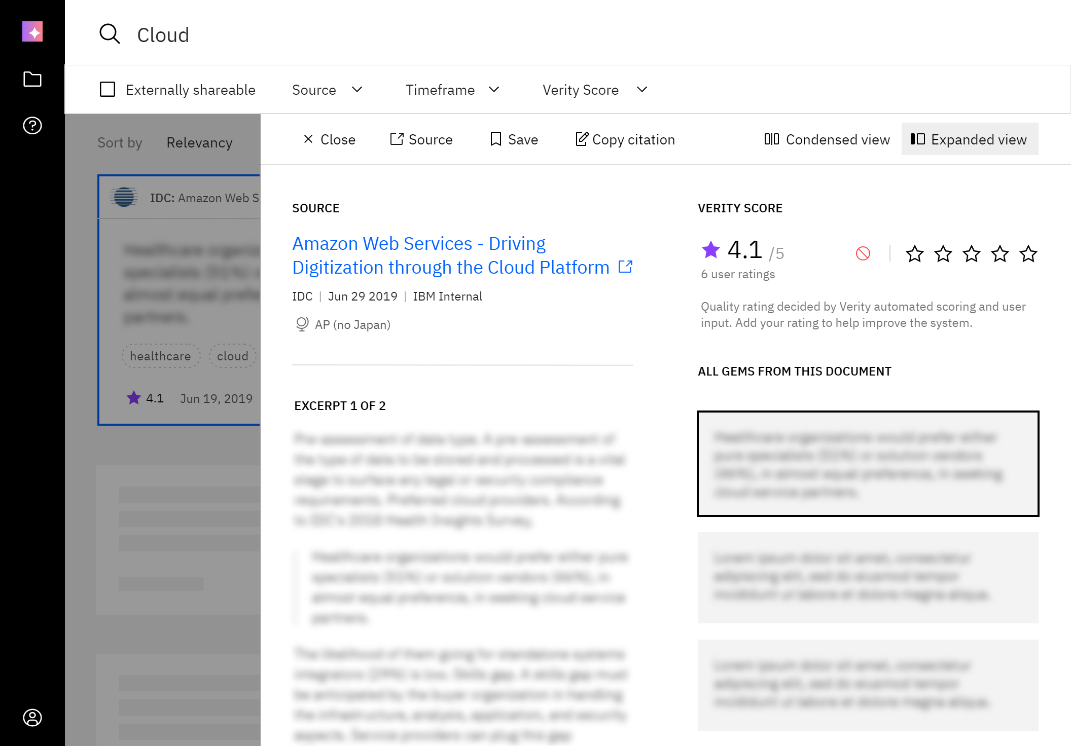
Eventually, we decided on having the expanded view be the default, as it better presented value and app functionality off the bat. The improved readability and presence of the detail pane controls also meant that users were more aware of the option to switch to the more fast-browsing mode of the condensed view.
At max size breakpoints, there was enough space to show the expanded view without using the overlay.
When I outlined Verity's basic UI structure in accordance to general Carbon guidelines, the mixed approach I settled on became a personal favorite of mine going forward -- fluid width up to medium breakpoint, then left-aligned fixed width containers all spaced to a soft grid of 8/16px(or .5/1rem). Of course, this mostly applies to layouts where optimal reading length applies. This portfolio site follows a similar structure, with extra spacing on the left before the navigation to account for wide screens to better center the content.
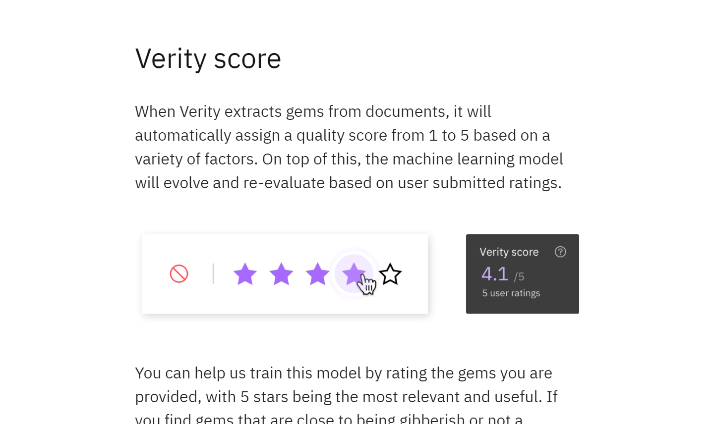
Our approach eventually leaned on consistent rating usage from sponsor users, supplemented by passive metrics from clicks, link clicks, and save/citations to translate into a gem's score.
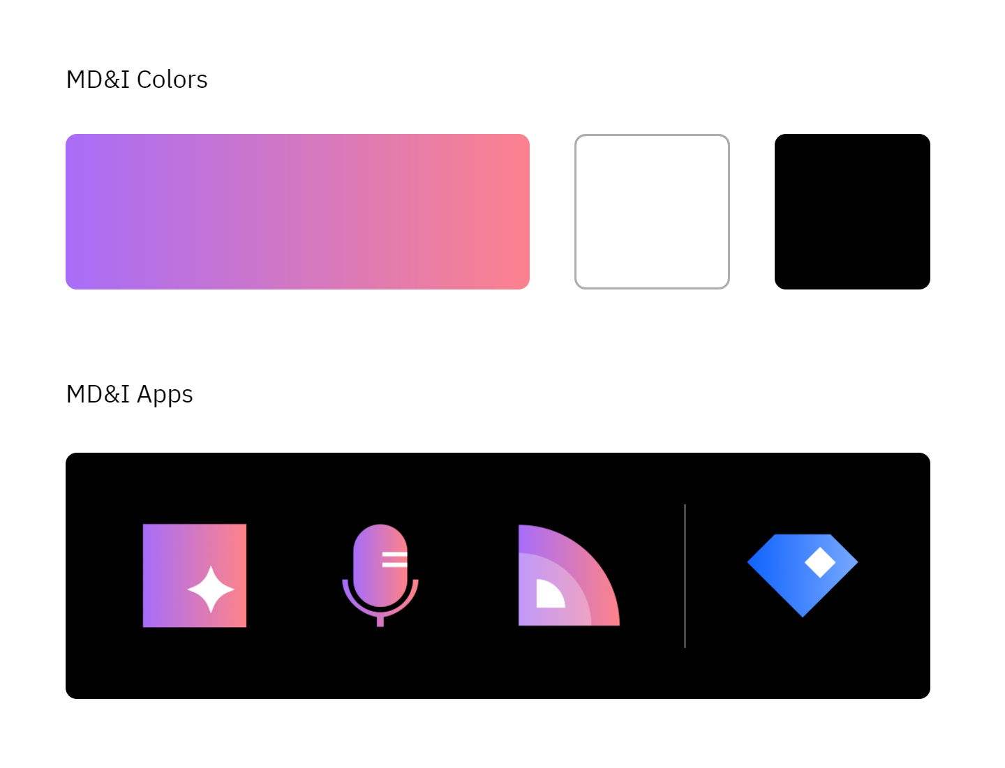
Each would use the brand gradient as a basic fill with a white geometric cutout. Earlier versions also allowed for a translucent white subshape(3rd icon) but was dropped for simplicity and a more defined base shape. Bluemine(rightmost icon) was kept blue given its place as an outlier app and, well, its name.
When our department was dissolved in late 2021, Verity was the only app that survived the sundering and transferred to another team, along with its product owner.